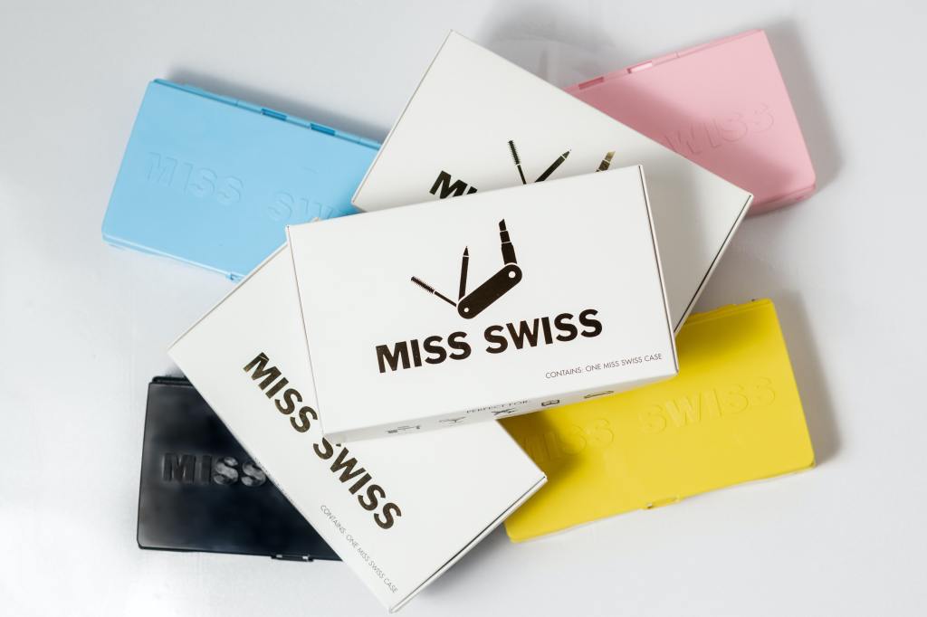
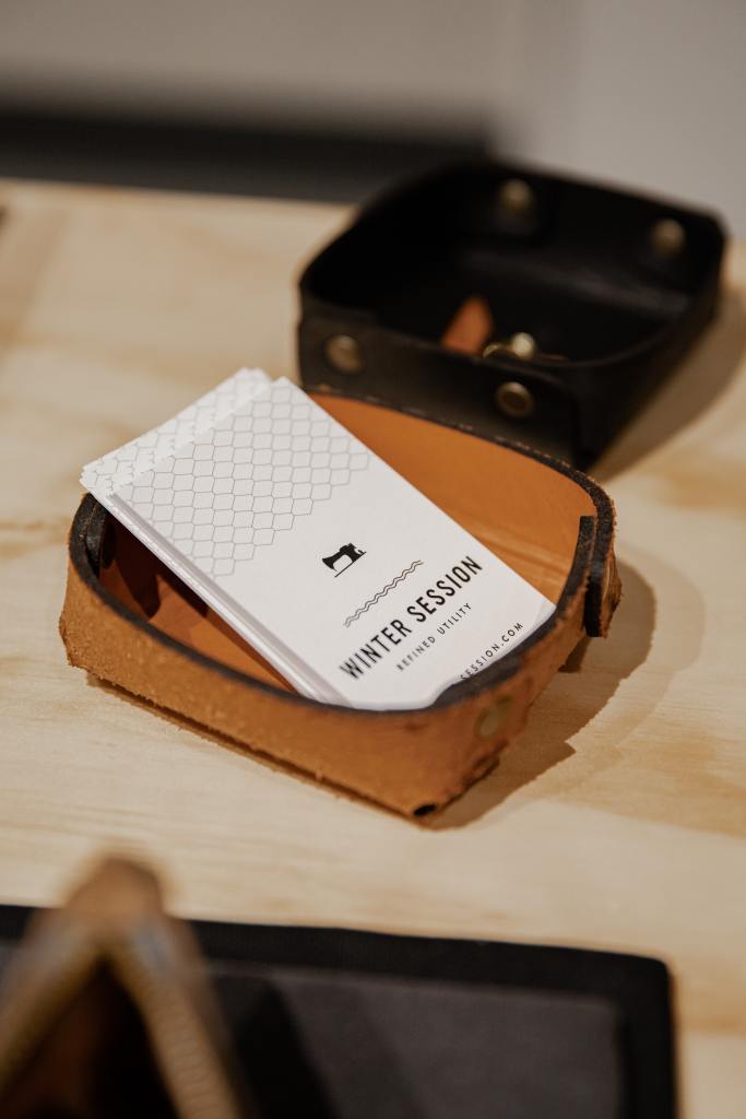
Business Cards are a tradition dating back hundreds of years and still to this day they are essential as a marketing tool. It’s a dog eat dog world out there when it comes to business, so you need to stand out and make a fantastic first impression! Business cards are personal, usually given out by hand and so when it comes to design, we need to give it a lot of thought. Tips and Tricks will guide you in a fun and enlightening journey into creating your very own amazing business card, clearing the design process of any obstacles and letting you focus on the task at hand.
Visualise
Let’s put you in the driving seat and name you the visionary. You already have a logo for your business; you know the colours and the feel of which your design is going to be based on. It’s good practice to imagine what it could be like before we start the designing process. After all, you will, in all likelihood, know the audience that you are trying to reach and have them so impressed by what you have to offer them.

Preparation
We can make the design process fluid and risk free if we plan properly first. It’s important to have all the design material and the information you’d like on the card ready and available before we start.
- Logo
- Tagline
- Visual Content
- Information
- Contact details
- Social media icons
- Something extra?
Now we have everything in one place we can start the design process.
Design
Shape
First of all let’s take into consideration the size, shape and orientation of your business card. Most business cards are cut to a size of 85 x 55mm. This will fit as snug as a bug into your potential customers wallets! Ask yourself what orientation suits the look of your design? Landscape or portrait? Landscape being the most common. However you might see people turning their heads when they notice a portrait. The shape of the card is another factor. You are not restricted to straight edges, you can round them off to show playfulness or do something more fancy to stand out. However, it’s important to keep in mind, the more complex the design, the more likely your card could get damaged.
Template
Picking a template is very important as this will give you the framework for your design and will inspire you. Remember the vision you had at the start and then make a strategic decision based on your branding and the information you’d like placed on the front and back of the card. Leave room for creativity later on.
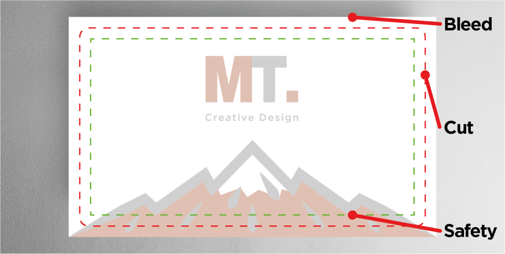
Safety line/Cut line/Bleed line
It is important to understand the boundaries of your design before we start adding our elements. The safety line indicates the limit to where any readable information should be placed. The cut line is there to indicate where the card will be cut to size. The bleed is there as a run-off of any design elements leaving the card cut line, making for a flush finish to your overall card design.
Layout
Now that you have found the right template to work with, we can begin adding the branded assets and information to the front and back of your card.
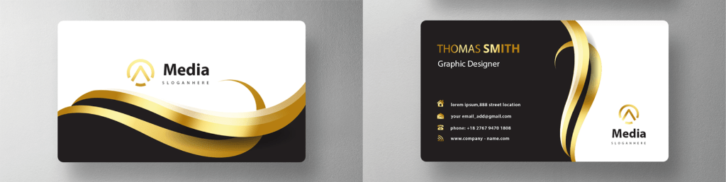
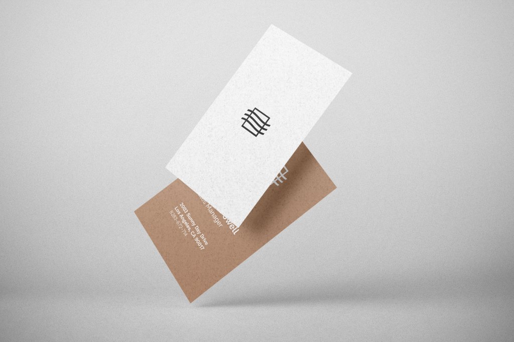
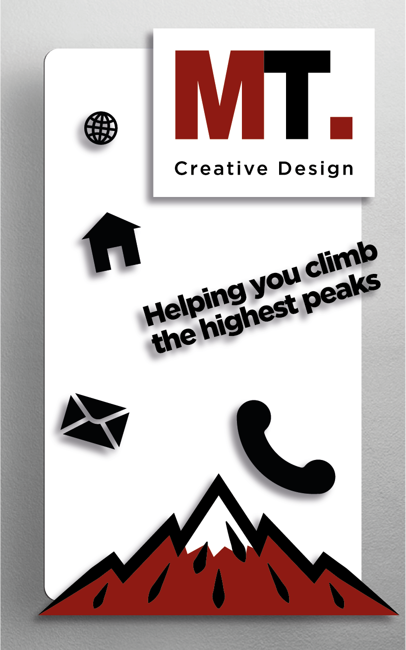
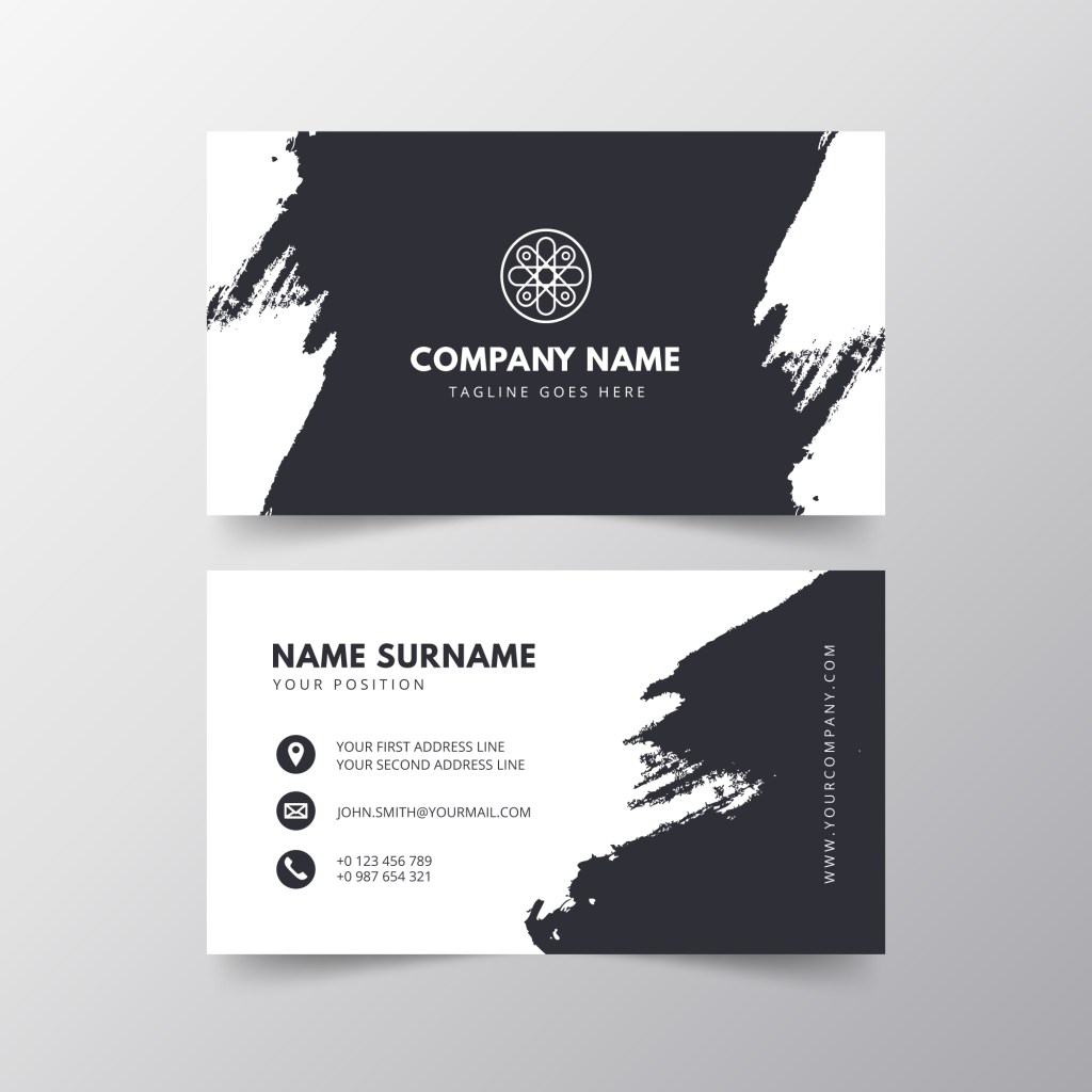
Logo
Your logo is the most important brand asset you have so make it stand out clearly! Start off with your logo centralised and enlarged enough for your contacts to see from a distance, yet give enough room to avoid suppression. If you’re after a more minimal or personal look, maybe keep the logo a smaller size with some white space for that purist feel. For added effect, it is good practice to have a smaller version of the logo on the backside of the card, tucked away on either side of the bottom corners. Some businesses will have guidelines to aid you in this process but in cases where it is up to you alone, it is wise to set your own design rules.
Colour
Your colour palette is important. It creates the feel of your branded material and will have hold your contacts’ attention. Your logo is a good place to start and then expand on. So think of ways to incorporate the logo and other elements on the card using the colours you select. It is good practice to only use up to three colours which compliment each other. A simple black and white is perfectly acceptable, can look sharp and clean. However, if you feel like you are struggling there are plenty of colour reference websites there to help you.
Visual Content
You may want to spice things up a bit with some visual aids. Pictures and graphics can speak a thousand words, halving the time it takes the reader to understand what it is your business is about. If you are selling a product, maybe feature it on your card? Stock images, vector designs and patterns can be found on www.freepik.com where you can simply search your desired content. It is important to keep all these visual elements in balance and prioritise the important information on your card.
Font
The font you use will give the card its character and will depend on the business or service you are promoting. The font should be clear and readable, to give the reader an instant idea of who you are and what you do. You should stick to using this font throughout the card to demonstrate consistency and professionalism.
Tagline
Most commonly seen underneath the logo, the tagline is there to keep the reader hooked and communicate more information. A typical tagline consists of a bolder version of your chosen font or, in some cases, an entirely different font all together. It is important to keep what we call a hierarchy in order that the reader focuses on the more important information.
Contact Information
There are so many ways to get in contact these days. On the one hand, you have traditional contact information which is your email and website addresses plus phone numbers and, in some cases, your employee’s name. On the other hand, you have your social media. Social media information tends to be in an icon format for the reader to then search manually. All this information should be clear to read and the font no smaller than 8pt. Remember that there are 2 sides to your card and so information can be placed accordingly to your preferences.
Adjustments and Check for Spelling
We are now coming to the end of the design process and it’s now time to align and adjust until you are 100% satisfied. But the biggest and most important tasks for you now are…
CHECK FOR SPELLING!!!